class: center, middle, inverse, title-slide # Fundamentals of Data Visualization in R --- # An Important Workflow Tip 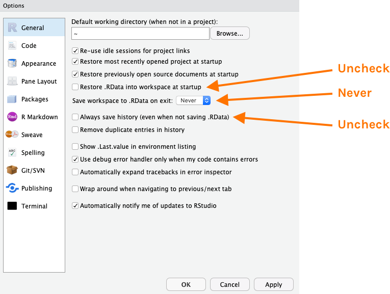 --- class: inverse, center, middle, dk-section-title # Grammar of Graphics --- ## Grammar of Graphics 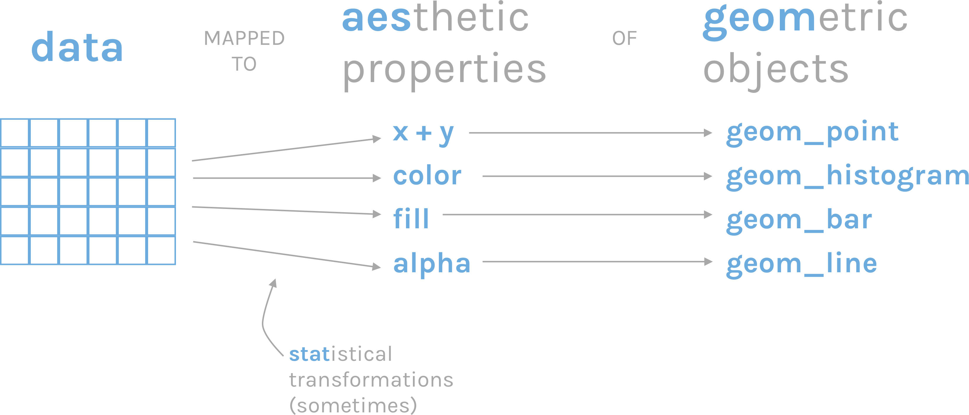 <!-- --- --> <!-- class: middle --> <!-- <p style="font-size: 150%";> --> <!-- The grammar of graphics is based on the insight that you can uniquely describe <i>any</i> plot as a combination of a dataset, a geom, a set of mappings, a stat, a position adjustment, a coordinate system, and a faceting scheme. --> <!-- </p> --> <!-- — Garrett Grolemund and Hadley Wickham in [R for Data Science](https://r4ds.had.co.nz/data-visualisation.html#the-layered-grammar-of-graphics) --> --- class: middle, center 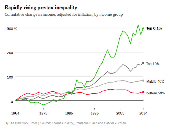 --- class: middle, center 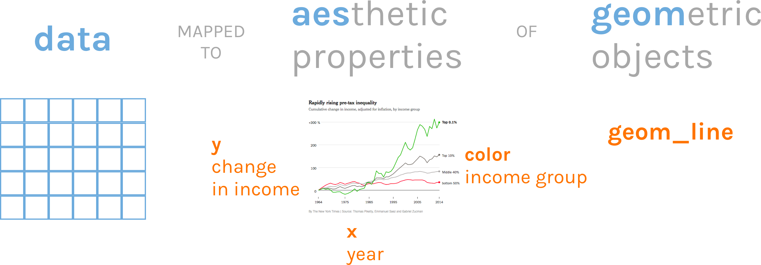 --- # ggplot2 .pull-left[ ```r ggplot(data = inequality_data, mapping = aes(x = year, y = income_change, color = group)) + geom_line() ``` ] .pull-right[  ] -- *Note: `ggplot` uses the + where `tidyverse` uses the pipe. Make sure you don't flip the two.* --- class: inverse, center, middle, dk-section-title The remainder of this section of the course does not use slides. See instead [this RMarkdown document](https://github.com/rfortherestofus/fundamentals/blob/master/data-visualization-examples.Rmd) with examples.